Sports Booking Portal
Over two weeks, I redesigned the University of Bath’s sports booking portal to make reserving facilities faster and more intuitive.

Problem
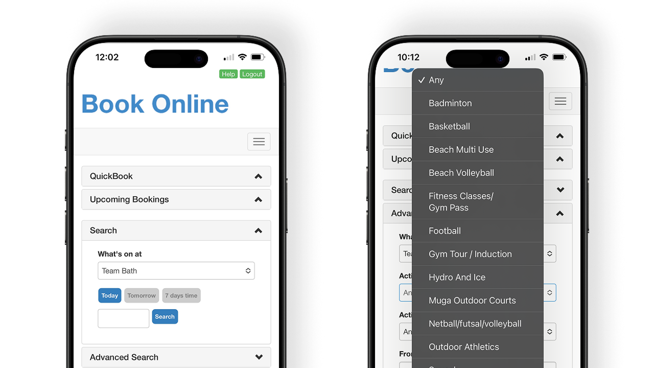
The University of Bath has an online portal allowing students to book facilities such as tennis courts for recreational use.
❗However, students reported frustration with unnecessary steps, unclear navigation, and a cluttered UI.
Solution
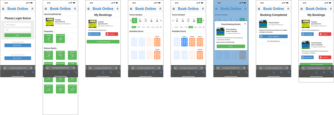
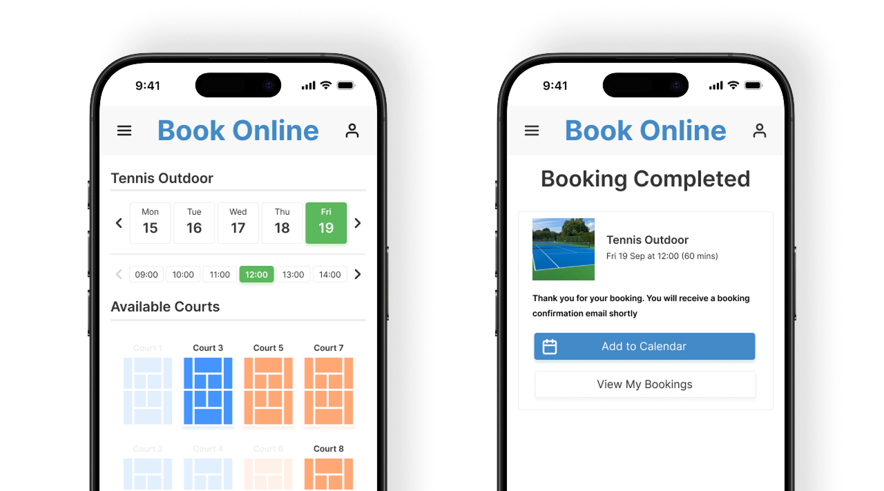
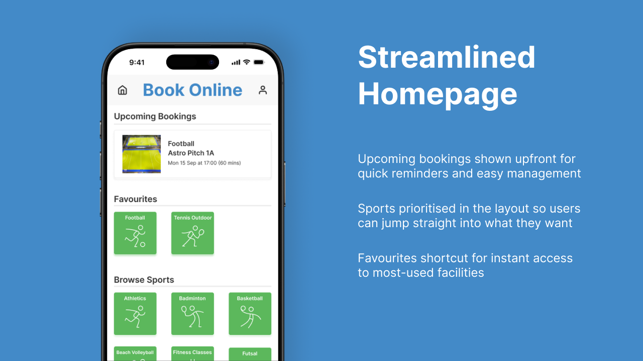
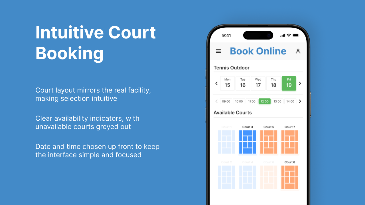
The redesign focused on simplifying the core booking flow, cutting down unnecessary steps and aligning the interface more closely with the real-world experience of selecting and reserving a court. While the project focused primarily on tennis bookings, ideas for wider facility bookings and managing existing reservations were also explored during ideation.
✅ Improved booking flow with few steps and pages.
✅ More intuitive interface with stronger mapping to real-world space of facilities being booked.
Process
The prototype was developed through a user-centred process aimed at making bookings faster and easier. Research with the existing portal shaped early ideas, while prototype testing with the same users confirmed clear improvements in both satisfaction and efficiency.
User Observation
To validate my assumptions and uncover pain points, I ran think-aloud tests with two participants unfamiliar with the portal. Both struggled to locate tennis court availability and found the process unnecessarily long. This confirmed a need to simplify navigation and clarify availability.
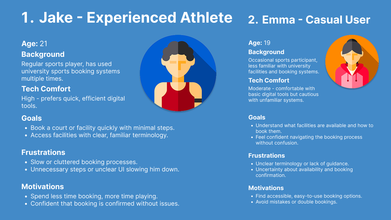
Personas
Based on the user studies, I created two distinct proto-personas: Jake and Emma. Jake, a repeat user seeking a streamlined booking experience, became the primary persona for developing the user journey map.
The prototype was developed through a user-centred process aimed at making bookings faster and easier. Research with the existing portal shaped early ideas, while prototype testing with the same users confirmed clear improvements in both satisfaction and efficiency.
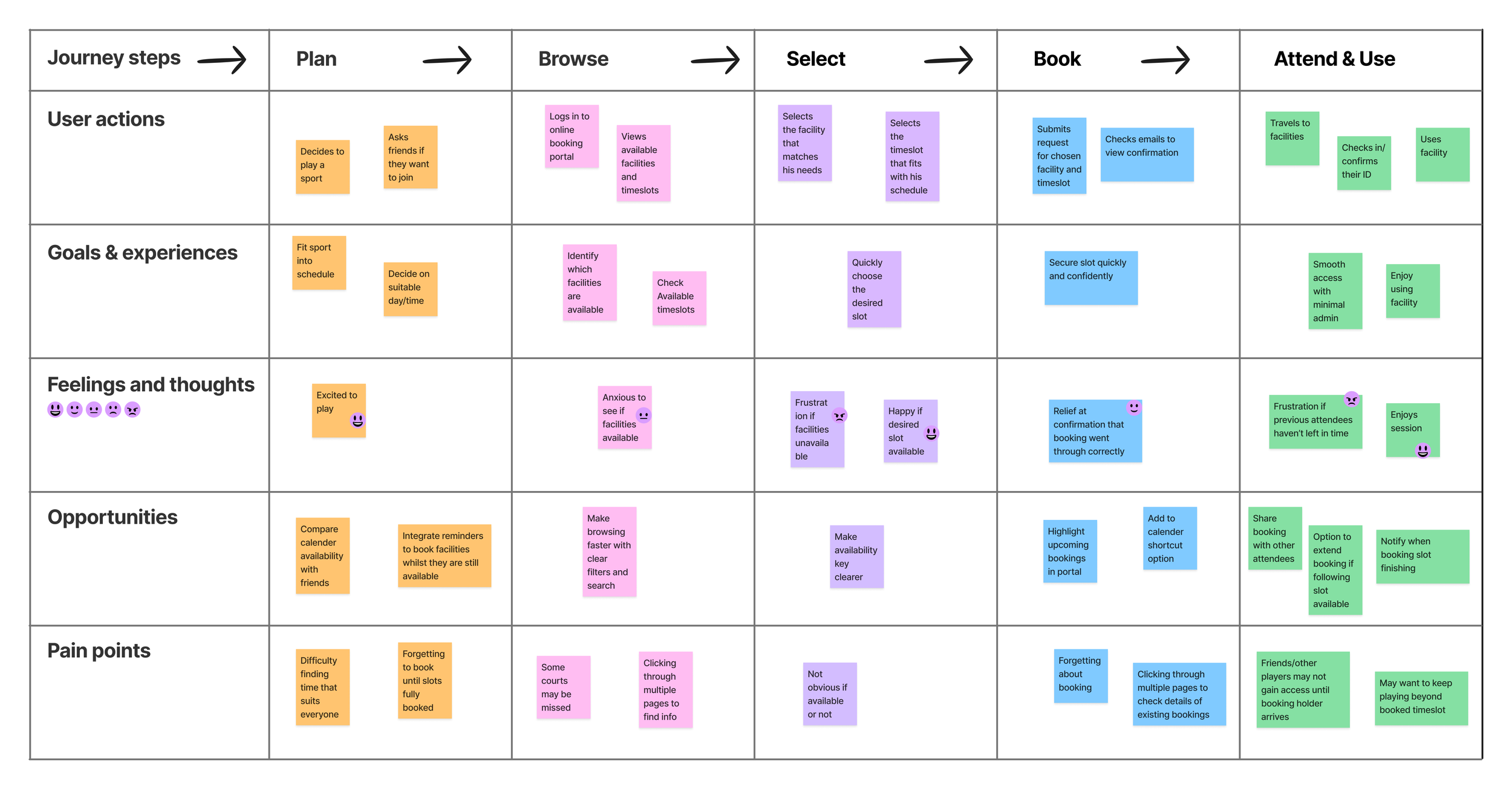
User Journey Mapping
I mapped the key stages of booking a facility to uncover pain points - such as the need to click through multiple pages just to view availability. These insights highlighted opportunities to streamline the process and directly shaped the redesigned booking flow.
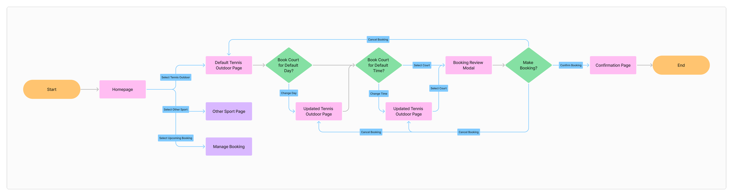
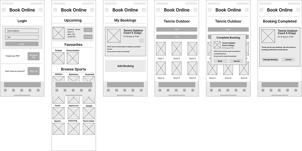
User Flow
I designed a simplified user flow that reduces the booking journey from five steps down to just three. This streamlined process makes booking quicker, more intuitive, and less frustrating for users.
Concept Sketches
I translated the new user flow into quick sketches, exploring different ways the portal interface could support faster, simpler booking. These sketches acted as a low-cost way to test ideas before committing to digital design.
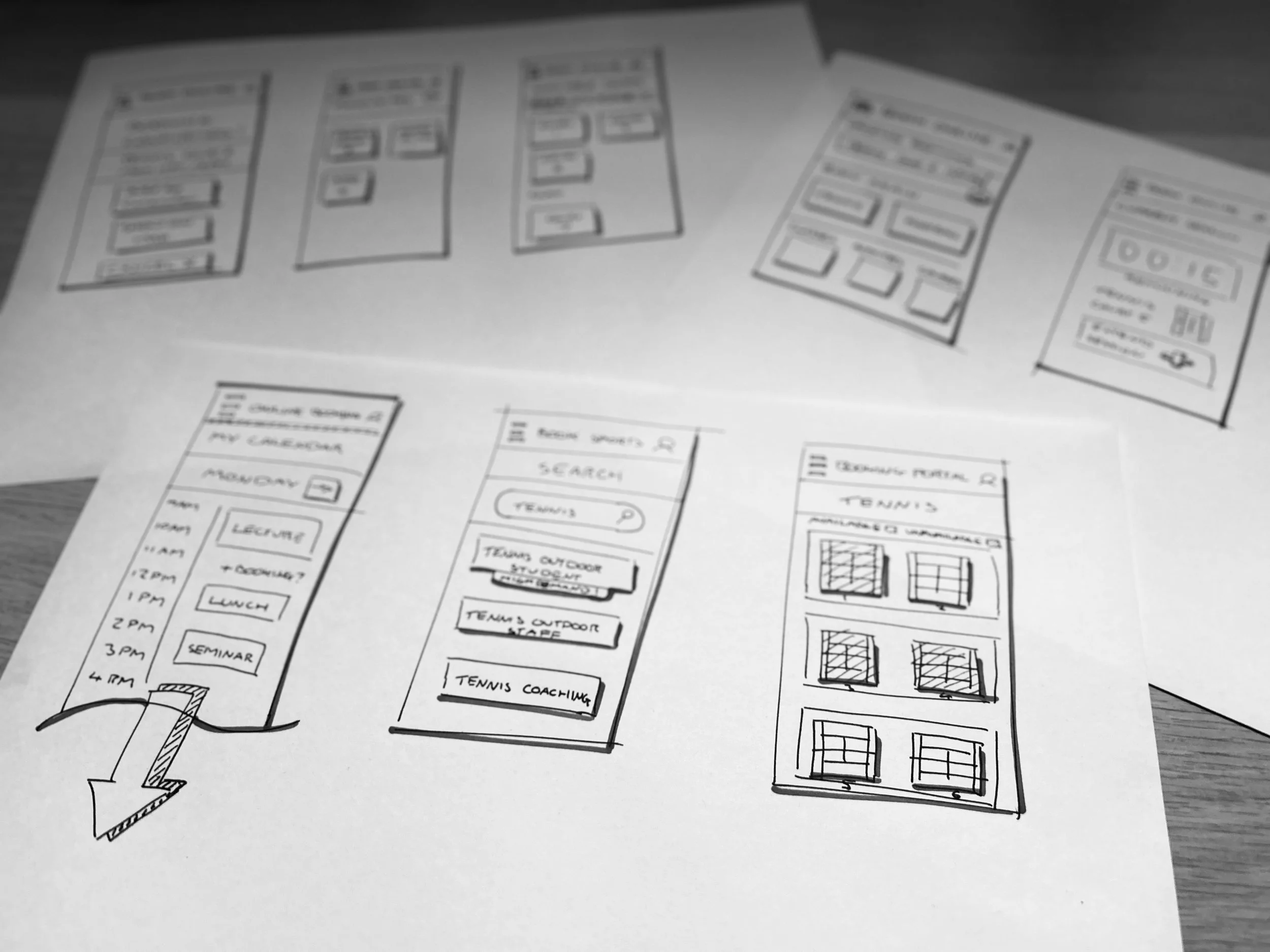
Wireframing
The strongest sketch concepts were developed into wireframes in Figma. This stage allowed me to plan layouts on an actual phone screen and prototype the new flow to check usability early on.
Prototype & User Testing
The wireframes were evolved into a high-fidelity prototype for user testing. User feedback was positive, and efficiency gains were clear - one participant completed their booking 70% faster.