Redesigning the Sports Booking Experience
Overview
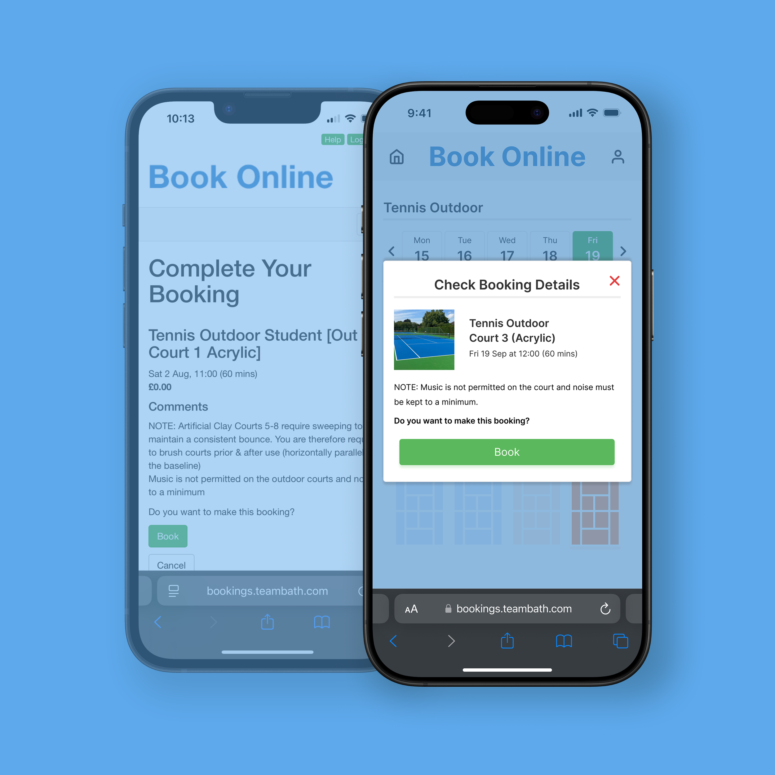
I redesigned the University of Bath’s online booking portal to make reserving sports facilities faster and more intuitive.
Role UX/Product Designer
Duration 2 weeks
Tools Figma, FigJam
Deliverable Interactive Prototype
Background
Project Brief
Redesign the booking experience to reduce friction and create a faster, more intuitive user journey.
Context
As a regular user of the University of Bath sports booking portal, I found booking facilities unnecessarily time-consuming and unintuitive. This self-initiated project explored how the experience could be simplified while maintaining the portal's core functionality.
The Starting Point
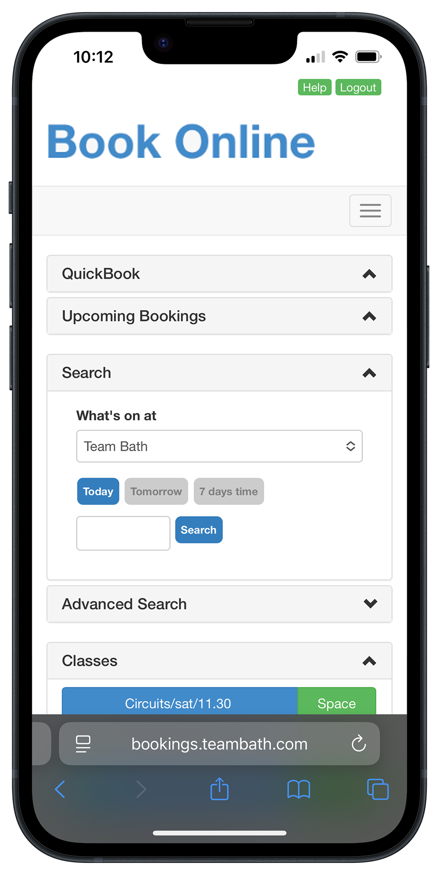
Primary actions hidden below expandable menus
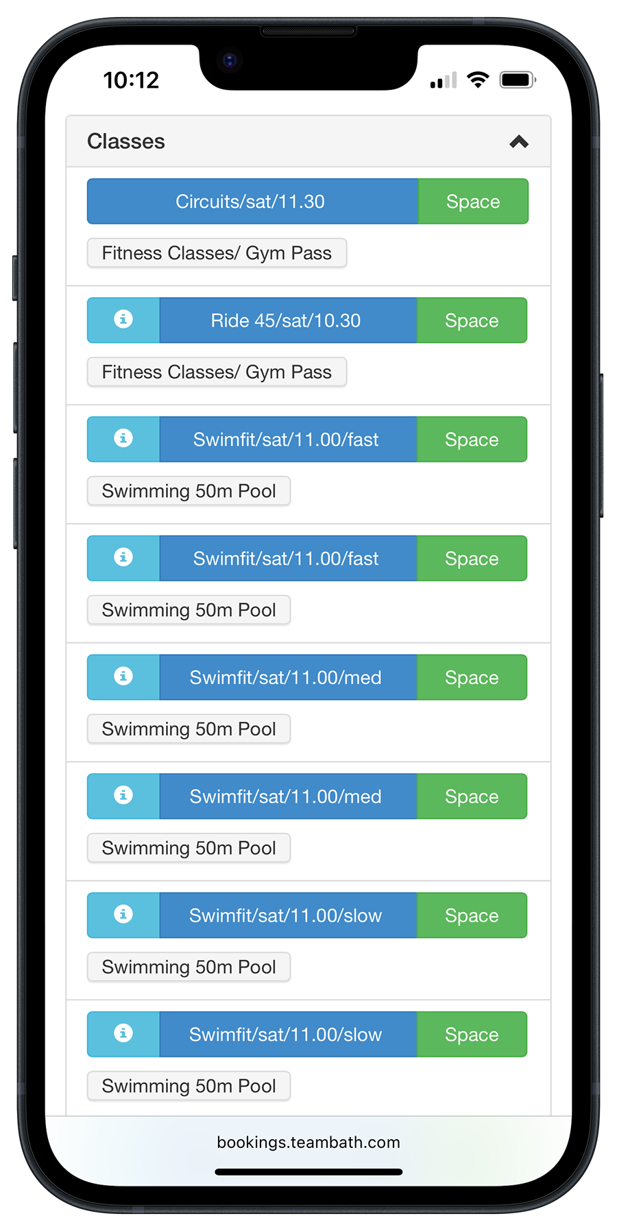
Long scrolling lists make finding activities time-consuming
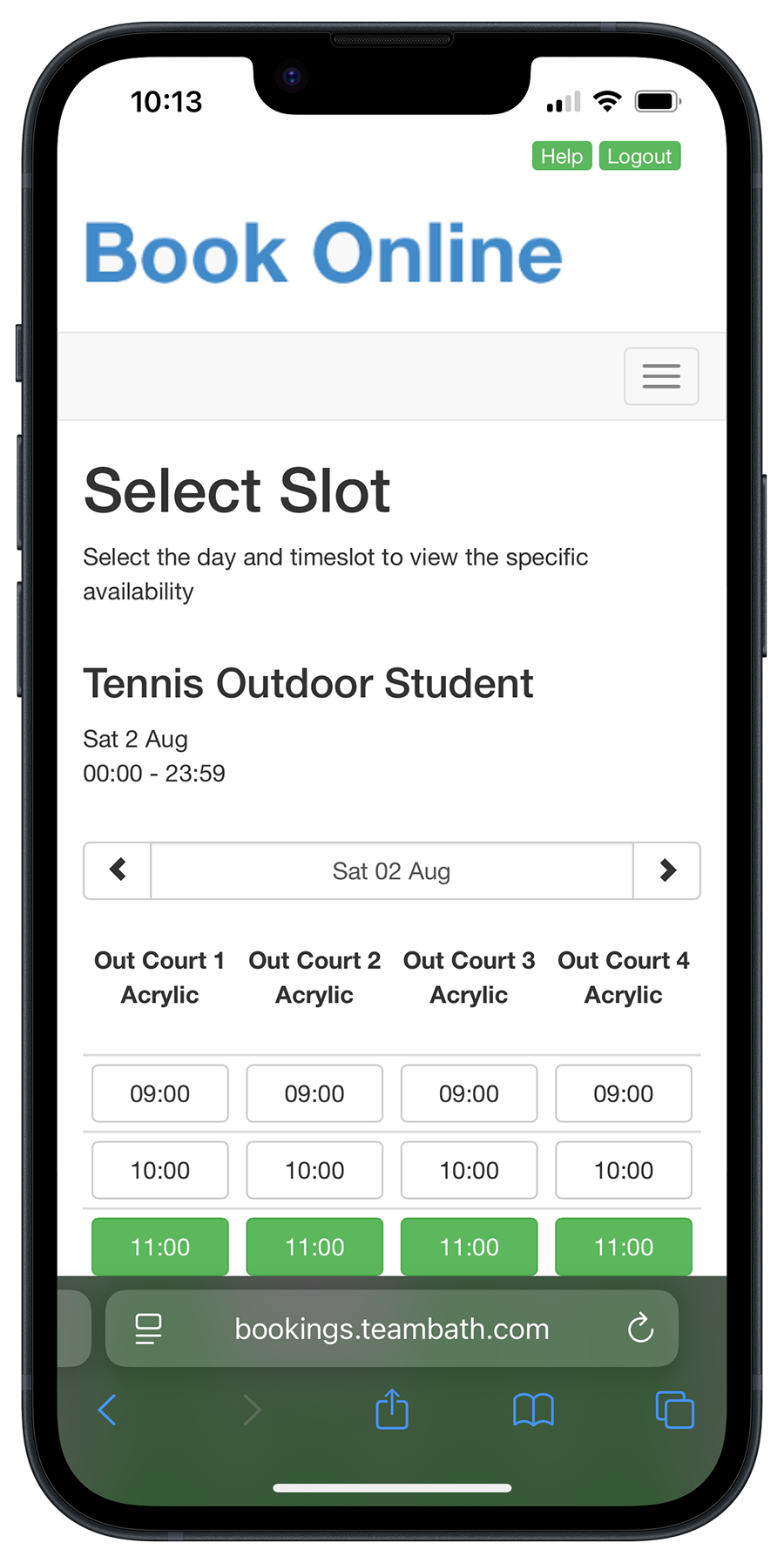
Court and time selection require vertical and horizontal scrolling
Process
The prototype was developed through a user-centred process aimed at making bookings faster and easier. Research with the existing portal shaped early ideas, while prototype testing with the same users confirmed clear improvements in both satisfaction and efficiency.
01 Understanding Users
User Observation
I conducted a user observation study to understand how new users interacted with the existing booking portal and to validate the usability issues I had experienced myself. Participants were asked to book an outdoor tennis court on a specific date while thinking aloud. Screen recordings and follow-up questions captured their interactions, frustrations, and decision-making throughout the task. The observations highlighted several recurring usability issues, which informed the redesign priorities described below.
“The first page had a bit more on it than necessary”
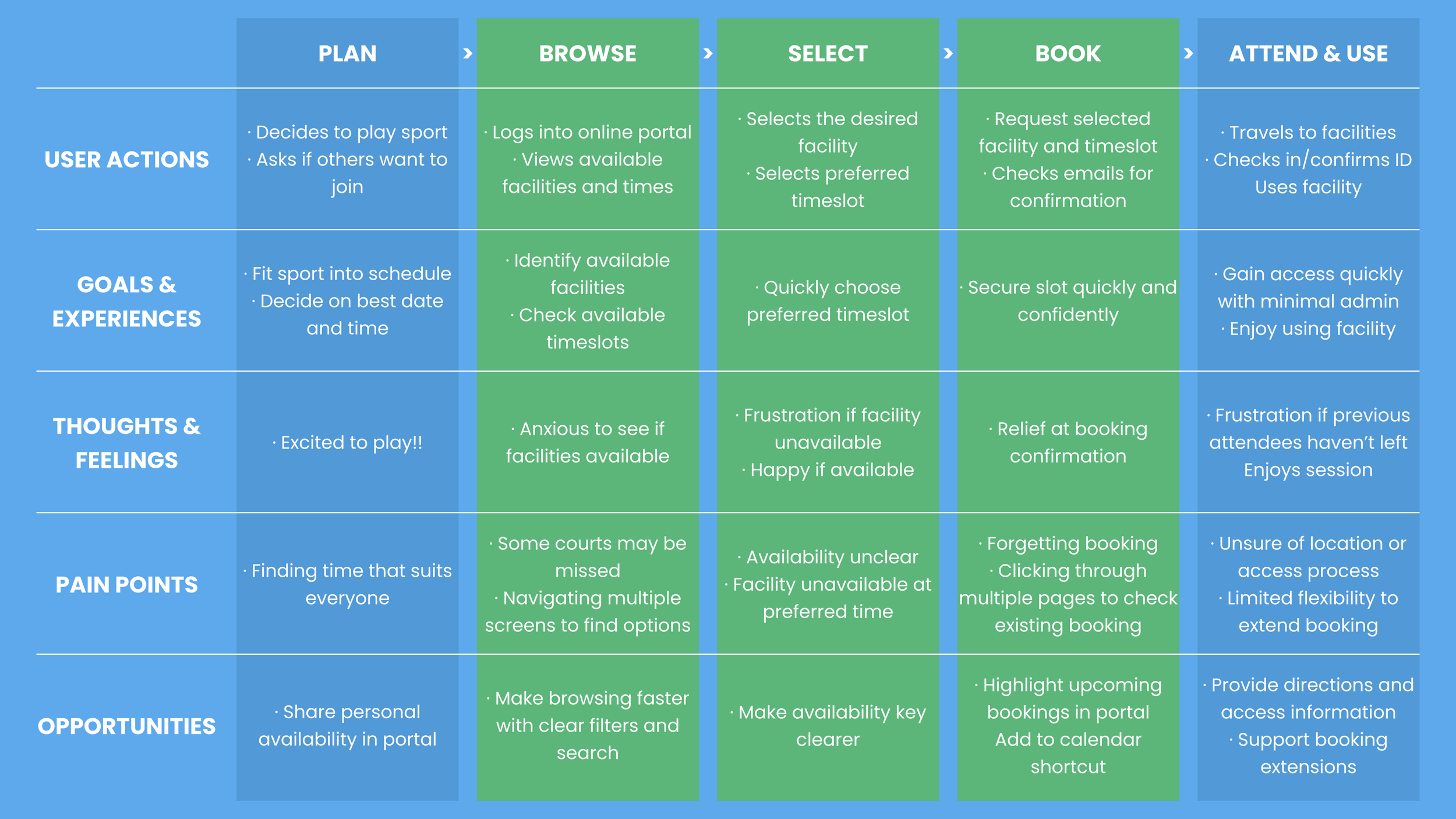
User Journey Map
I mapped the key stages of booking a facility to uncover pain points - such as the need to click through multiple pages just to view availability. These insights highlighted opportunities to streamline the process and directly shaped the redesigned booking flow.
02 Redesigning the Booking Journey
Design Objectives
Reduce the number of booking steps.
Surface commonly used actions earlier.
Make court availability easier to interpret.
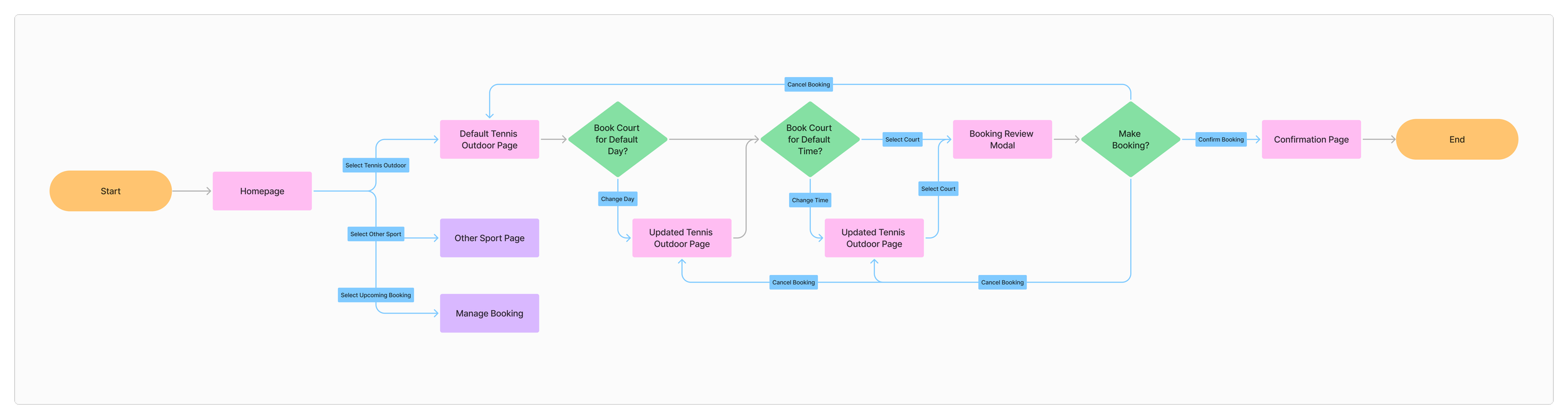
Revised user flow
The booking flow is the core of the user experience, taking students from deciding to book a court through to confirmation. Analysis of the existing portal revealed an unnecessarily complex journey, with multiple navigation paths, excessive page transitions, and frequent vertical and horizontal scrolling. I redesigned the flow to remove unnecessary interactions, reducing the minimum number of actions required to complete a booking from five to three, while also decreasing the number of screens users needed to navigate.
Concept Sketches
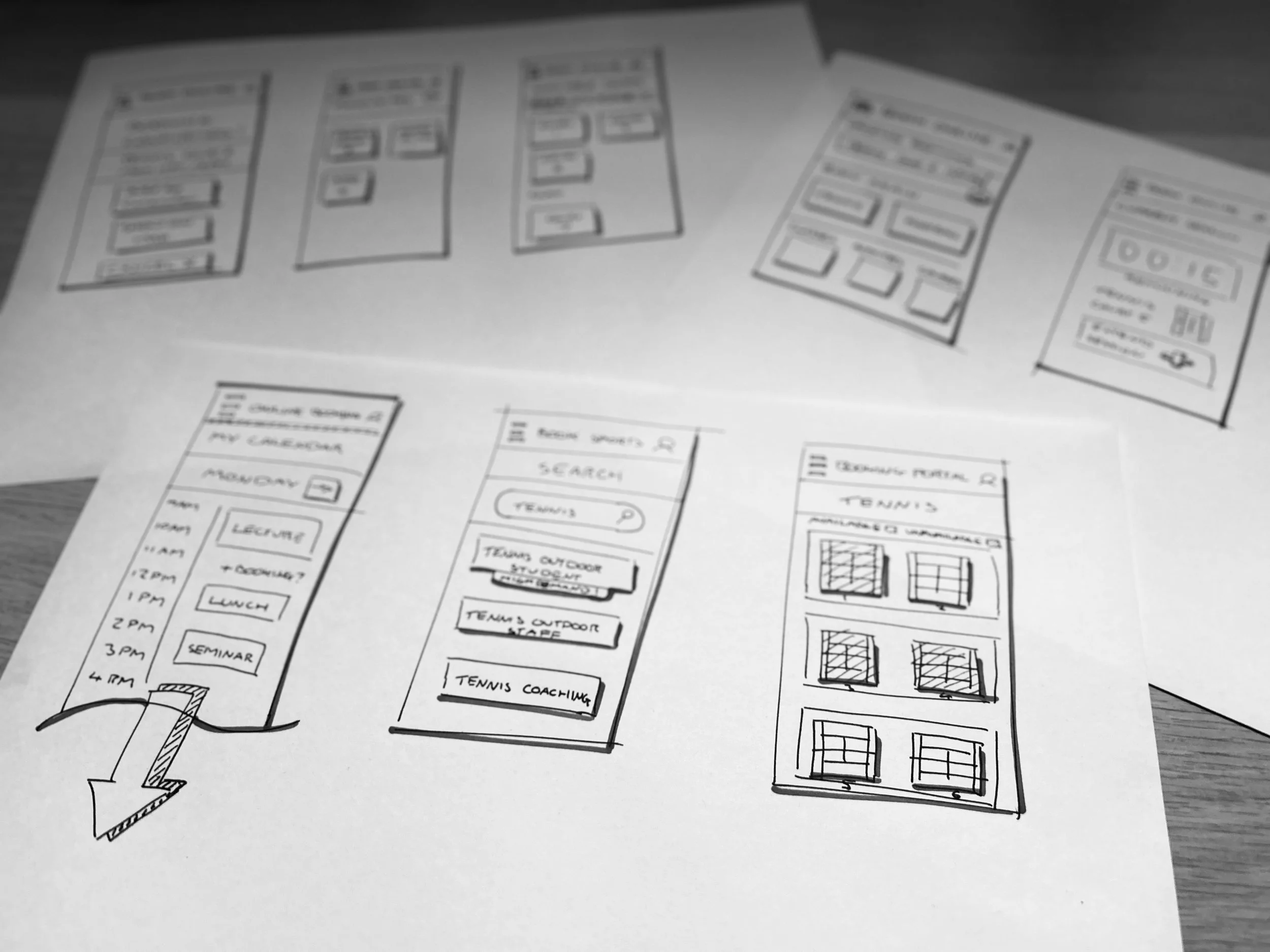
I translated the new user flow into quick sketches, exploring different ways the portal interface could support faster, simpler booking. These sketches acted as a low-cost way to test ideas before committing to digital design.
Digital Wireframes
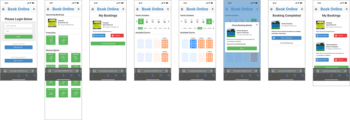
The strongest sketch concepts were developed into wireframes in Figma. This stage allowed me to plan layouts on an actual phone screen and prototype the new flow to check usability early on.

03 Validation & Refinement
Interactive Prototype
The wireframes were evolved into a high-fidelity prototype for user testing. I matched the existing colour palette for continuity and similarly followed a similar design system for buttons and fonts.
Usability Testing
User feedback was positive, and efficiency gains were clear - one participant completed their booking 70% faster.
Solution
01 BROWSE
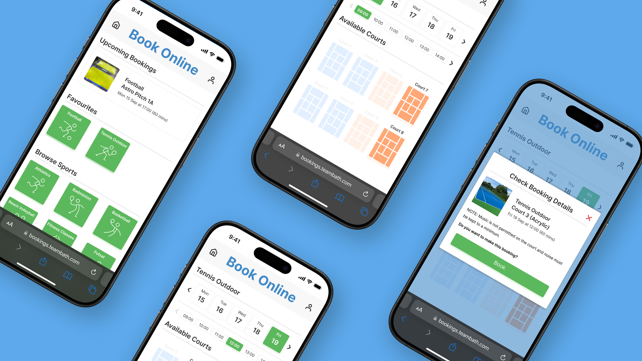
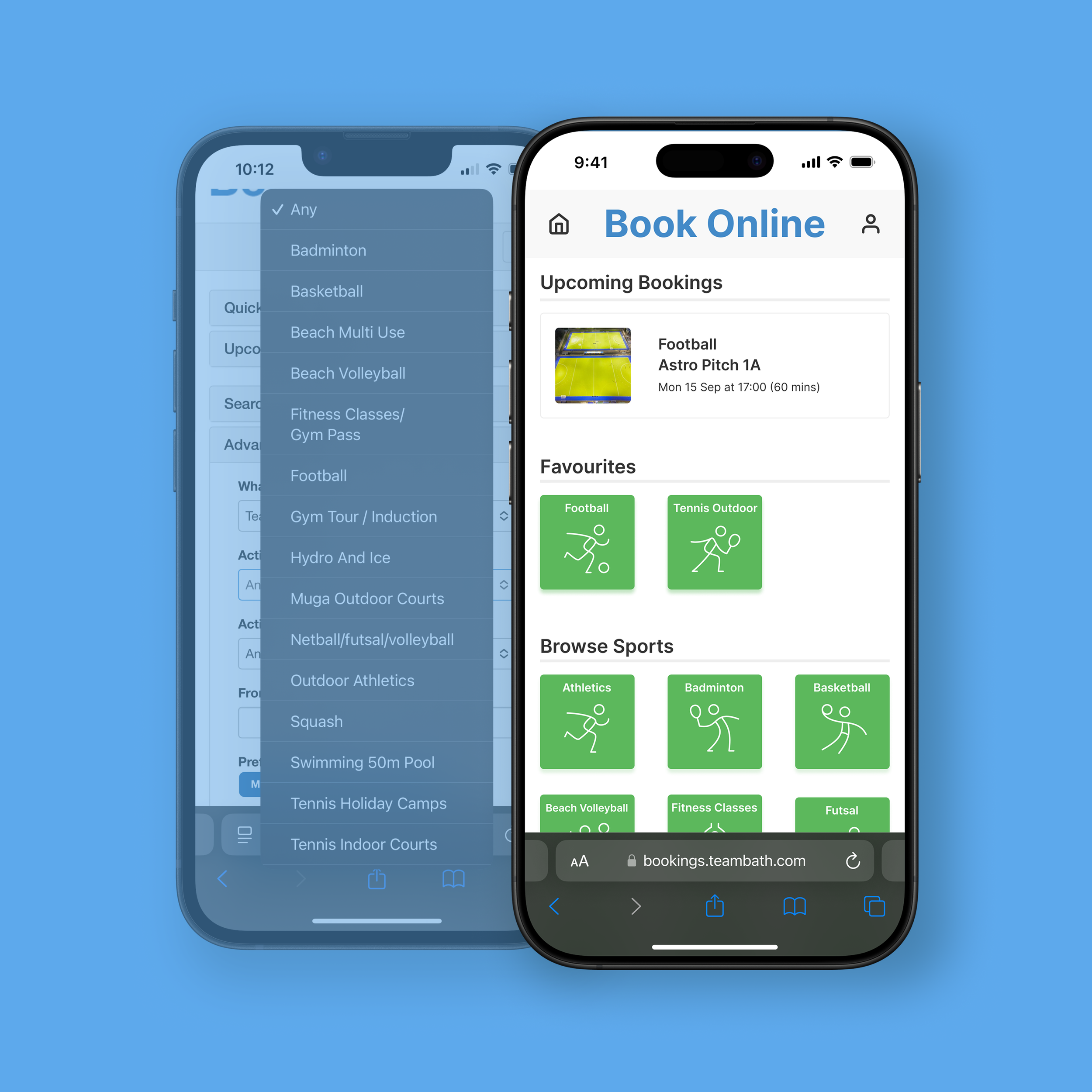
Streamlined homepage prioritising key actions
Simplified landing page with a clearer visual hierarchy
Expandable menus removed to improve discoverability
Upcoming bookings and favourite sports prioritised for quick access
Large sport buttons with icons enable faster, more intuitive selection
Secondary information deferred to later steps to reduce cognitive load
02 SELECT
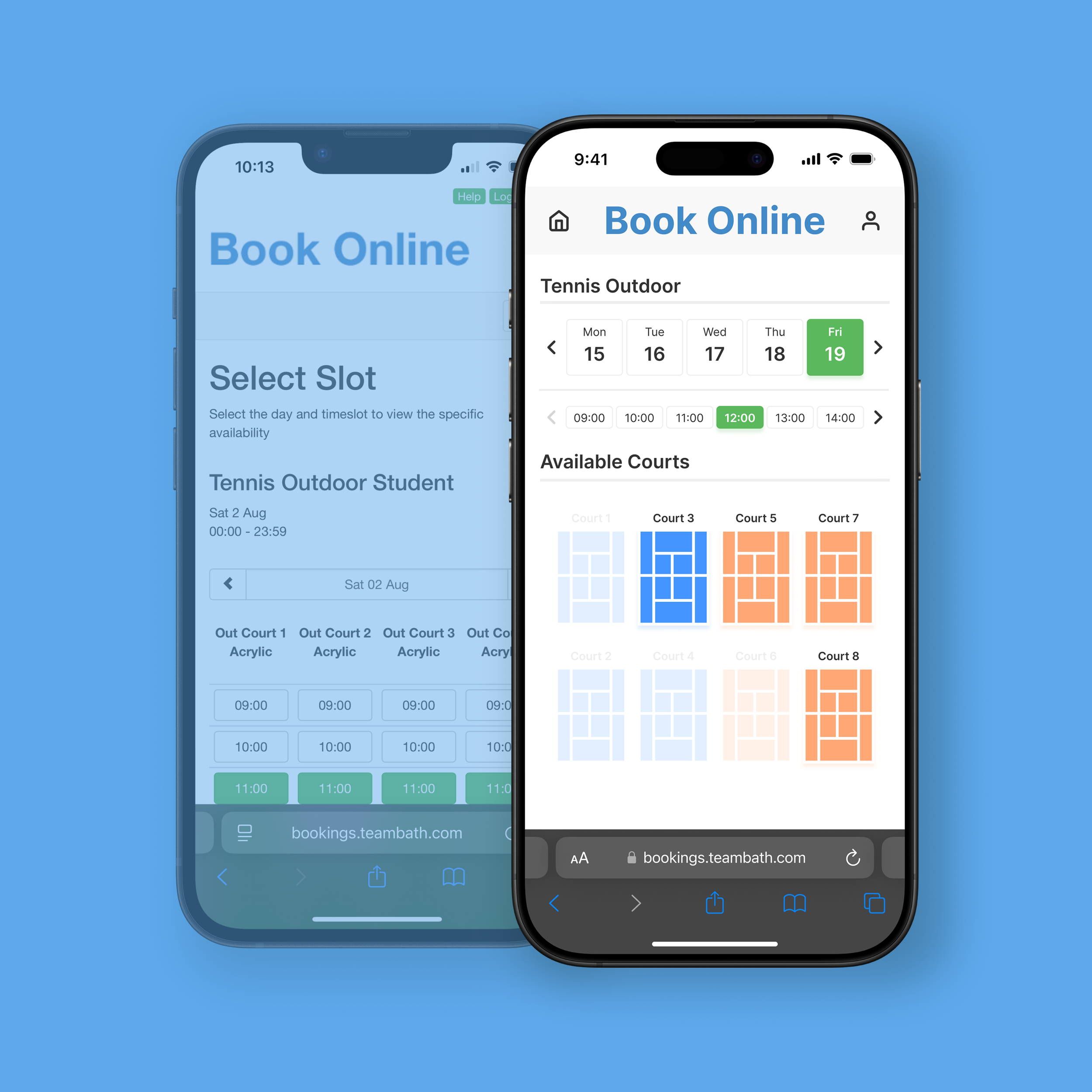
Visualising court availability through a familiar layout
Date and time selection simplified into a single, clear step
Selected date, time, and court highlighted for confirmation
Court layout mirrors the real-world facility, making selection more intuitive
Available courts clearly distinguished without requiring a separate key
All options visible without horizontal or vertical scrolling
03 BOOK
Maintaining context during confirmation
Overlay confirmation keeps users within the booking flow rather than introducing a new page
Booking details clearly summarised for final review
Facility imagery helps users confirm they have selected the correct location
Prominent confirmation button makes the next action clear