Grocery Store Navigation App
I designed an app to help users locate and purchase shopping list items.
Problem
Long Shops
- Need quick product location in-store to save time
Accessibility
- Accessibility issues (Leah with screen reader, Reena with dyslexia)
Budgeting
- Finding affordable products quickly
Unfamiliarity
- Possible difficulty with unfamiliar store layouts / communication
Solution
✔ In-store navigation
✔ Product verification
Understanding the User
User Personas
I developed two proto-personas to help guide design decisions, Sue and Farid.

User Journey
Sue needs to consider food requests from her whole family and ensure she finds everything they need. She is impatient to get everything she needs so it’s important that she can find items easily and efficiently.
Farid needs to make sure he buys everything he and his mum needs whilst sticking to their budget. He is intimidated by nnavigating the store as he struggles with the language and recognising what he needs.
Design Development
Design Exploration
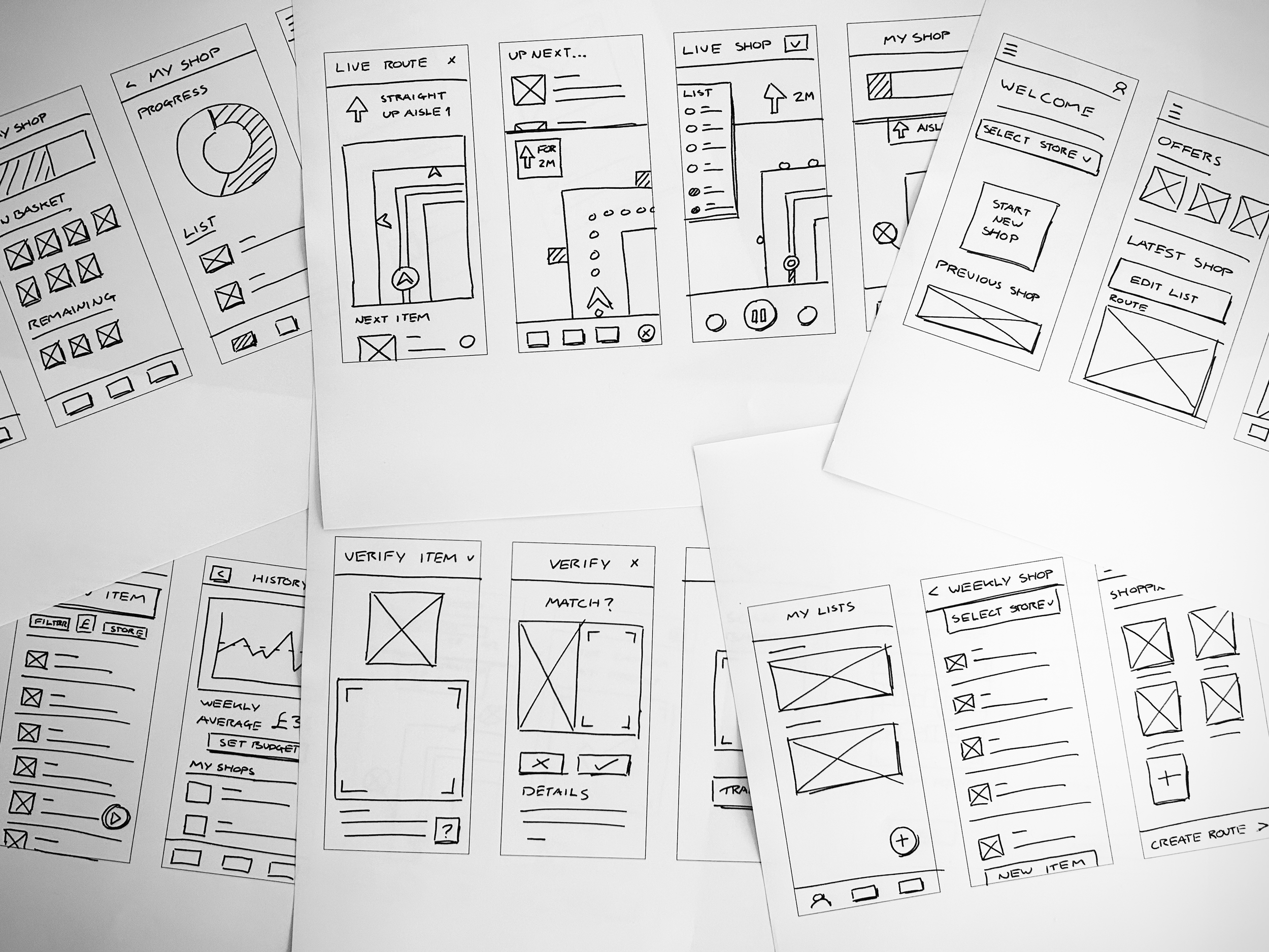
After rapid sketching key features (based on ‘how might we?’ questions), I created a range of wireframe concept sketches.
Selected wireframes were combined to create a refined set of wireframes for the complete user flow.
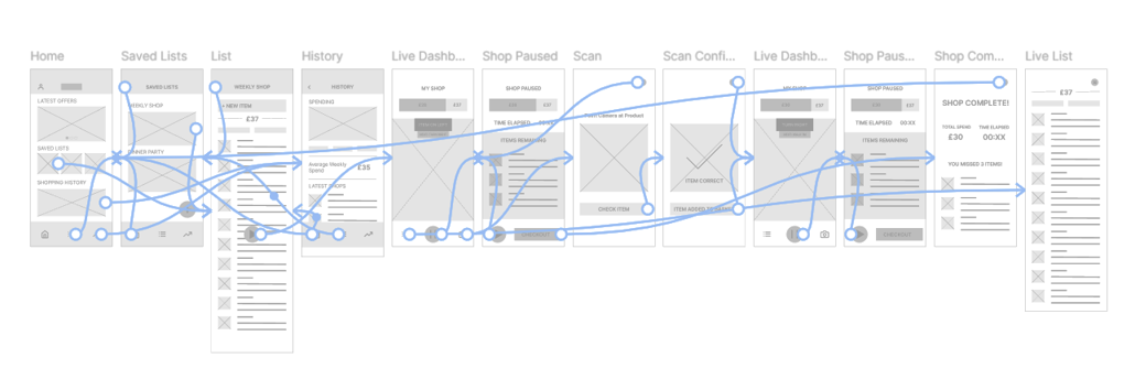
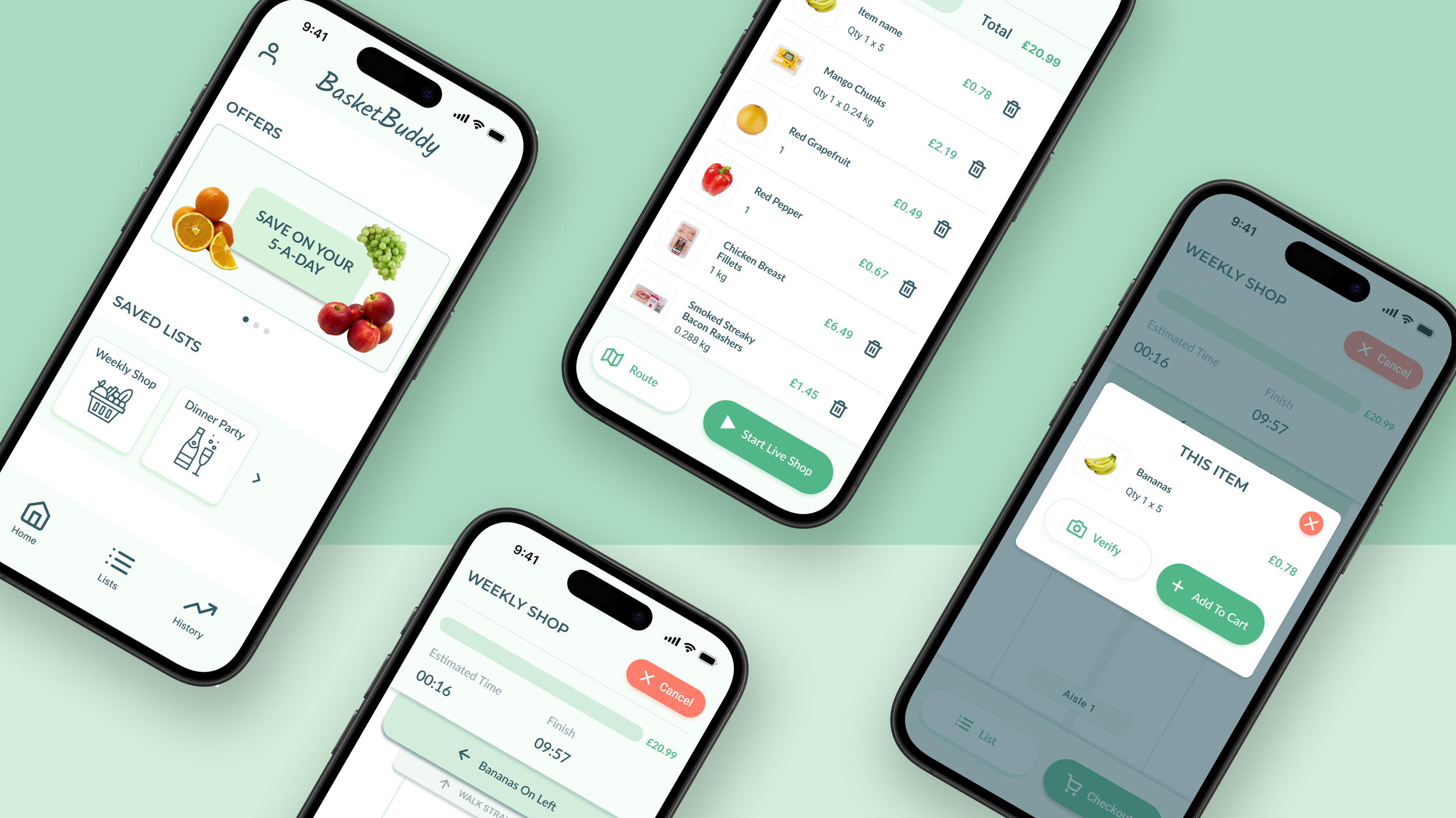
Digital Wireframes & LoFi Prototype
I converted the refined wireframe sketches to digital versions in Figma and added interactive navigation between screens to create a LoFi prototype for user testing.
Usability Testing
Study One Findings
Users need better cues that they can tap saved lists on the home screen.
The start navigation button should be redesigned to be more intuitive.
A button should be included to allow users to exit without checking out.
Study Two Findings
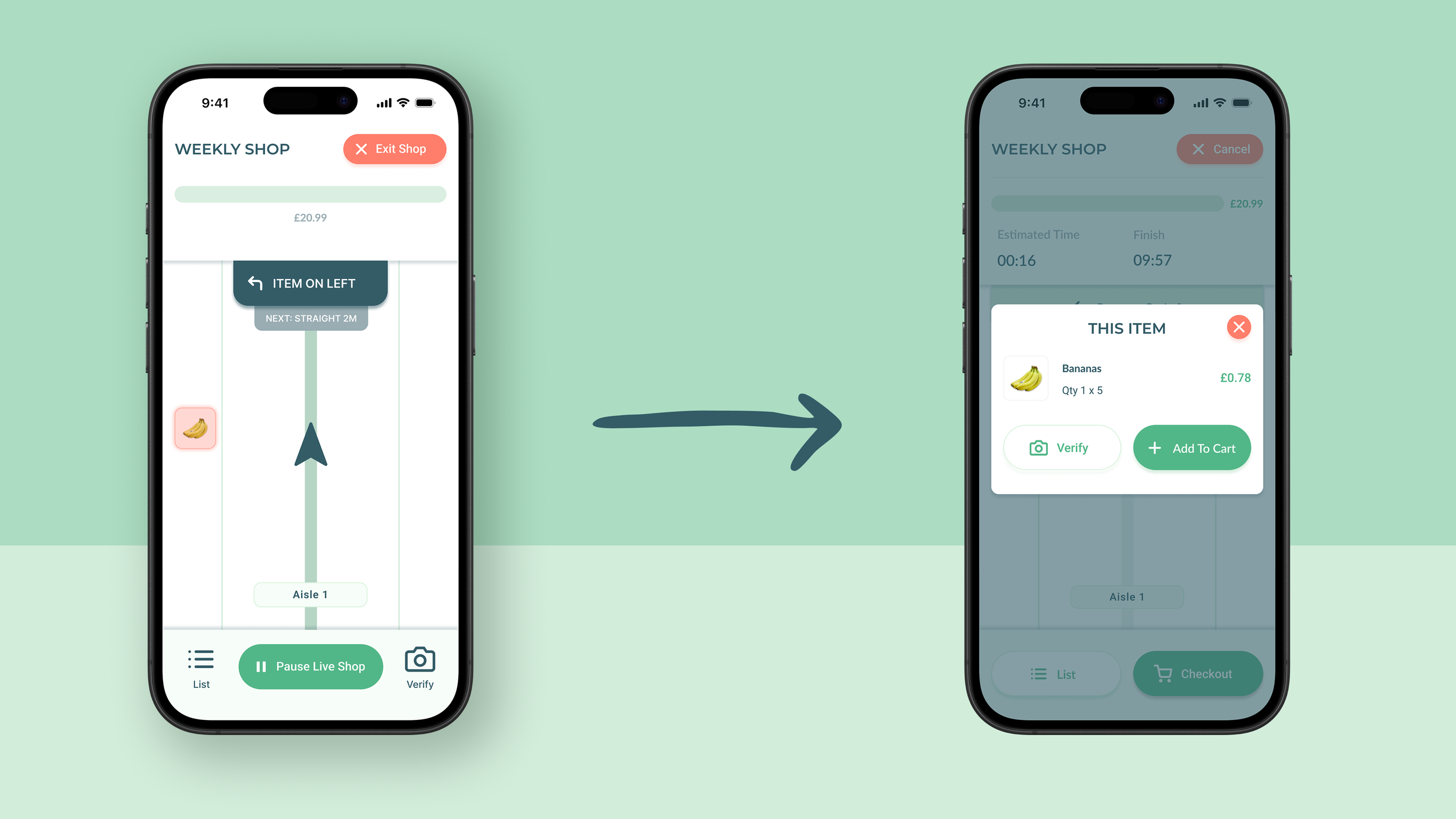
The exit and checkout flows should be redesigned to distinguish them.
Users need better cues to use verify feature before adding item to basket.
Live navigation dash should be redesigned to clearly show what users do and do not need to buy.
Refining the Design
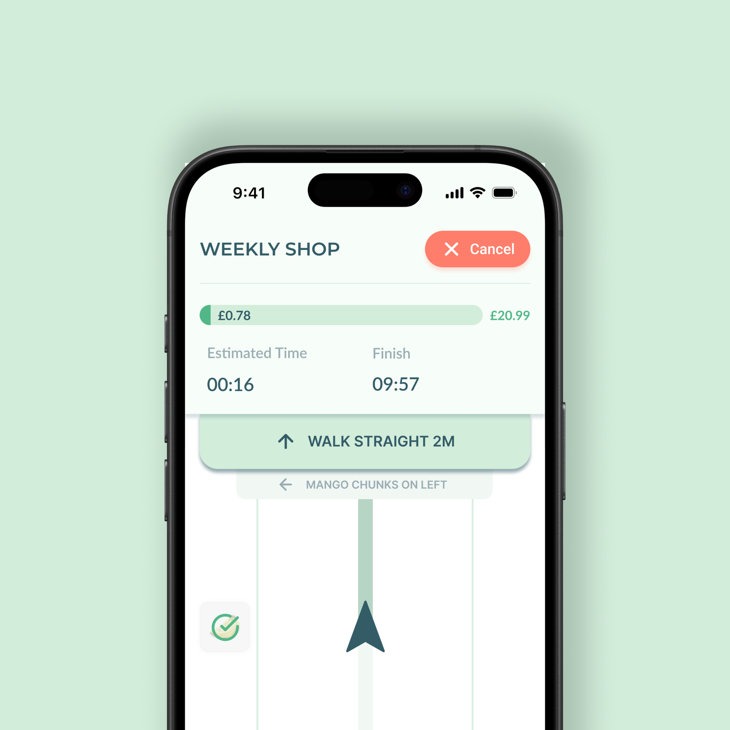
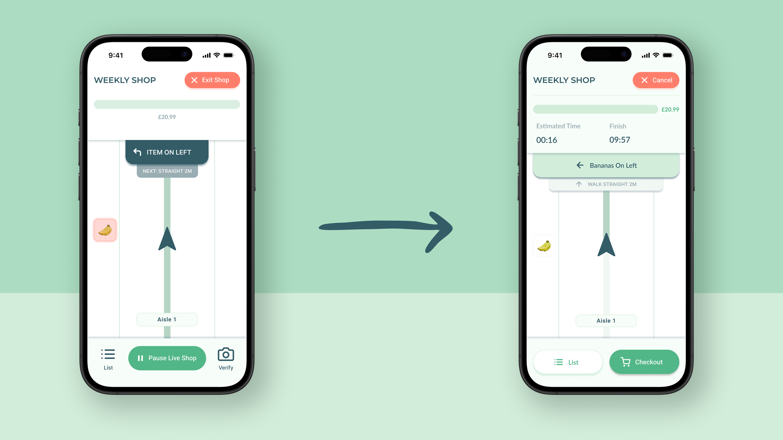
Live Navigation Dashboard
The live navigation dashboard was updated to replace the ‘Pause’ and ‘Exit’ buttons with, more distinct, ‘Checkout’ and ‘Cancel’ button. The live shopping progress bar was expanded to show estimated shop duration.
Verify Feature
The verify feature was moved to be accessed from the item overlay instead of the bottom bar. Placing it in closer proximity to the item information reinforces its purpose and encourages its use before adding the item to cart.